Designing More Accessible Maps Starting with the Basemap
October 6, 2026
Aleah Ross
When people think about accessible mapping, they often focus on basics like color contrast, avoiding problem color pairs, and adding alt text. But accessibility goes further. Every visual decision shapes how someone understands and uses a map, starting with the basemap. Choosing an accessible basemap affects how you design everything else.
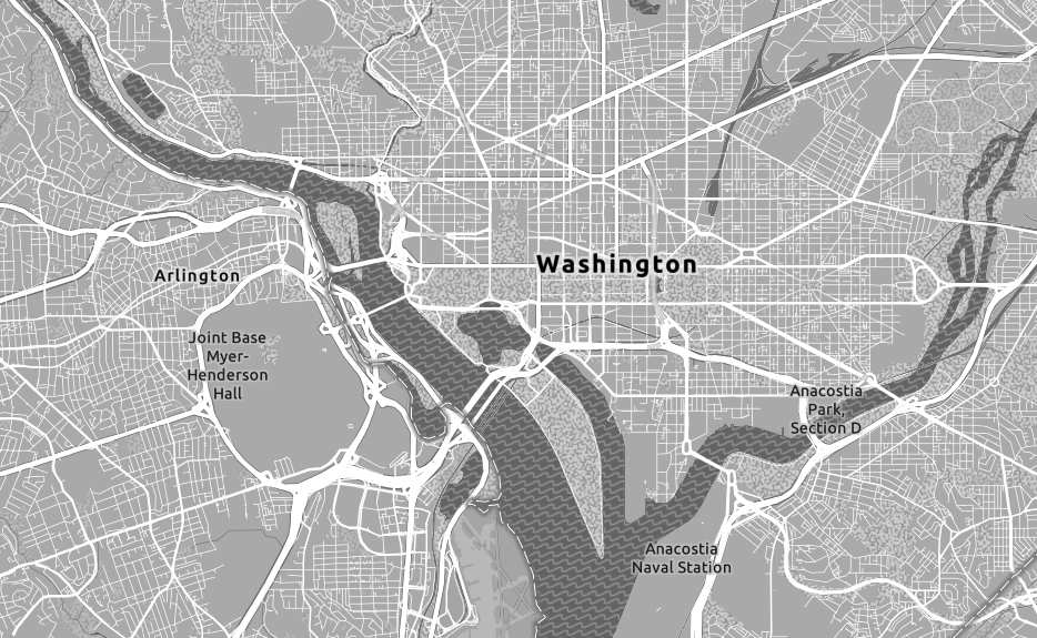
Andy Skinner’s Gray Version 2
We’ve been looking at Andy Skinner’s Accessible Basemap Gray Version 2 in ArcGIS Online. Skinner has worked in cartographic design for decades, including work on Esri’s vector basemaps and color ramps. He started creating accessible basemaps after people asked for options that better support accessibility and color vision.
In his Esri blog post, Skinner explains that this basemap adapts Esri’s Light Gray Canvas by adding more contrast between map features. The goal is to make basemaps easier to read for people with visual impairments, while still providing the functions cartographers need from a reference map.
The aim is not just to increase contrast. A basemap must balance different needs. It should provide geographic context without overshadowing the map’s main subject, and its features must still be easy to read.
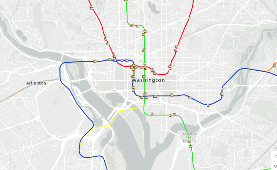
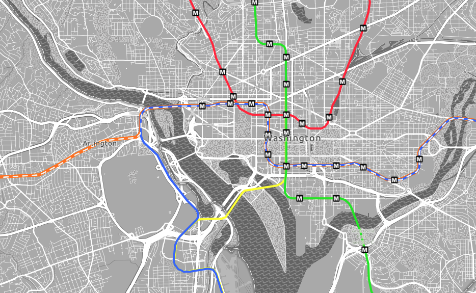
Gray Version 2 is noticeably darker than Light Gray Canvas, which makes reference information easier to read. However, you may need to adjust the visual hierarchy of your data to fit the new background. Accessibility isn't a single choice; it’s a series of decisions.
Why accessibility matters in cartography
Maps are visual tools, so visual accessibility determines if someone can use them. If a map relies on subtle color changes, faint lines, small labels, or hard-to-see differences, some people may miss the information it’s meant to deliver.
Designing for accessibility isn’t about creating a separate, simpler map. It’s about making a map that works for a broader audience.
Designing on an accessible basemap
A darker, more noticeable basemap gives you a stronger base, but it also changes how you design. Light, low-saturation colors that look good on a pale background may not stand out, so you need to be more deliberate with your symbology. You might need:
More saturated colors for thematic features
Stronger contrast between your data and the basemap
Line weights that stay visible at your map scale
Patterns or textures when color alone isn’t enough
Several visual variables to separate categories
Label colors and halos with adequate contrast
A clear hierarchy between reference information and the map’s subject
There isn’t a single color palette that works for every map. Check your symbology with the basemap, your data, the map’s scale, and your audience in mind.
Who it helps
Accessible cartography lets more people use maps. This includes people with color-vision deficiencies or low vision, those viewing maps in poor conditions, and anyone who benefits from a clear visual structure.
There’s another benefit as well. When important information isn’t tied to just one visual cue, the map becomes more reliable. Color isn’t the only tool; shape, size, pattern, line weight, placement, labels, and hierarchy all help communicate the message.
This is the idea behind universal design. Rather than designing for just the “typical” user, you plan for a wide range of people from the beginning. Accessibility then becomes part of good design, not a limitation.
Putting it into practice with AIR
We are creating a cartographic style guide for AIR’s print mapping workflows. The aim is to give their team a consistent visual framework so they can make maps that are cohesive, clear, and accessible.
The guide covers more than just colors and fonts. It addresses the basics of map composition: what elements belong on a print map and how they fit together. Topics include titles, supporting text, legends, scale bars, north arrows, symbology, color, typography, labeling, layout, and accessibility, all applied consistently across many maps.
How we can help
Picking the basemap is just one step in making a map accessible. The next step is to ensure the rest of the cartographic system fits with it. We help organizations create cartographic standards and design systems that offer practical guidance, making accessibility part of the process from the start.
If your team produces a collection of maps, a style guide gives everyone a shared starting point. Rather than making design and accessibility choices from scratch each time, you can rely on established principles, standards, and examples. This leads to a more consistent and inclusive mapping process.